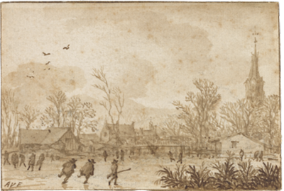
Article: Is that Drawing Right?
Notes on Authenticity and Connoisseurship
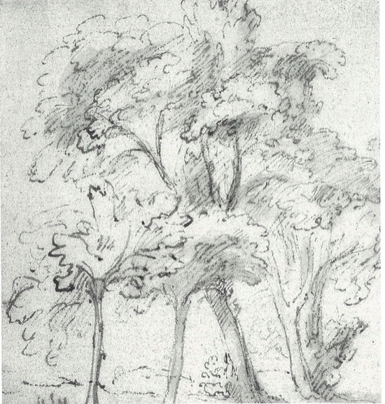
Enlarged detail, Cat. no. 10, Abraham Furnerius
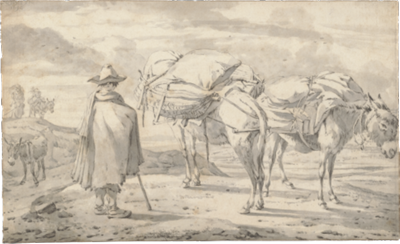
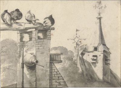
DUTCH ARTISTS of the seventeenth century were uncannily skilled at creating simple depictions of the truths of nature. It is this penetrating fidelity that first attracted my devotion to their drawings. The landscapes featured in this exhibition preserve timeless images of natural beauty from the labyrinthine ground cover of Lievens (Cat. no. 18) to the grassy polder of Rembrandt (Cat. no. 22), from the wind-swept homestead of Pieter Molyn (Cat. no. 20) to the windless sea of Willem van de Velde the Younger (Cat. no. 35), and from the summer idyll of Michiel Carrée (Cat. no. 4) to the winter frolic of Allart van Everdingen (Cat. no. 8). They record firsthand some quaint images the artists of the day found highly appealing, such as the avian roof-trappings of Cornelis Saftleven (Cat. no. 28) and the carefully rigged donkey-trappings of Willem Romeyn (Cat. no. 25). After years of receiving my most studious gazes, the forty masterworks presented here continue to elicit pleasure, learning, and awe - the ultimate paybacks from art. Yet, at another level, these 300- to 400-year-old sketches from the vision and imagination of gifted artists often have become the objects of my scientific curiosity and scrutiny.
The doctor’s perspective may have something to do with this analytical focus. My wife Leena and I are professionally and academically involved as orthodontic specialists. In clinical medicine, patient problems are best identified and addressed by asking questions, the right questions. In 1902, Rudyard Kipling succinctly framed the salient queries in a verse accompanying his story “The Elephant’s Child” (with my respects for Dr. Richard Asher, whose brilliant essay1 on this subject was published thirty years ago):
I keep six honest serving men
(They taught me all I knew);
Their names are What and Why and When
And How and Where and Who.
Rudyard Kipling
What follows is a multifaceted exploration of old European drawings. First is a rather basic introduction to some esoterica about the nature of old master drawings, the attribution problems they present, and the experts who are skilled at resolving these problems. Then, the drawing “style” of artists is discussed, emphasizing, as connoisseurs do, the thought-out strokes and passages of a composition. Finally, I attempt to introduce and illustrate some aspects of a concept of graphic stroke analysis that has informed my “eye” over years of purposeful study. It is based on scientific studies noting subtle, remarkable consistencies in the way individuals execute writing and drawing strokes. These findings, coming from outside the community of art scholars, will be freshly applied to provide some new graphic clues to the draftsman’s nonvolitional style and to his identity. Thus, in this essay, I shall be exercising several of Kipling’s serving men. In the process, I hope the boundaries of seeing may be extended for many other enthusiasts of the drawn image.
The Special Problems of Old Drawings
Until the nineteenth century, drawings made by European artists were seldom signed, annotated, or dated. Drawing with ink or chalk on paper was a method artists used to develop or test out their ideas, to practice their sketching skills, or simply to dawdle pleasurably, despite the high cost of paper. Drawings were considered peripheral to the artist’s principal task of painting enduring, and usually signed, color pictures on canvas or wood panels. For the most part, then, signatures or inscribed identification was considered unnecessary for these personal experiments on paper - an innocent omission often contributing to uncertainties in attribution a few centuries later.
Compounding this question of artist’s identity is the scarcity of old master drawings, even in earlier times. At least two influences, one psychological and the other methodological, may be responsible for the rareness of drawings from many European masters. Artistic insecurity probably provoked many of the old masters to suppress or destroy their drawings, so as not to detract from their more consequential oeuvre of paintings and sculpture. Michelangelo near death is said to have ordered the burning of his drawings and clay models.2 The size of the surviving corpus of his drawings, albeit an issue of current controversy,3 4 appears to be unusually small. The other influence is the common use of erasable tablets (tafeleten, in Dutch) as an affordable alternative to expensive paper.5 The tafelet was a stiff laminate of paper sheets, specially coated to facilitate metalpoint sketches and to make them easily erasable. The tafelet method, promoting efficient reuse of drawing and writing paper, surely helps account for the dearth of existing preliminary studies and experimental sketches by some well-known artists of the time. The complete absence today of authenticated drawings by great Dutch masters such as Johannes Vermeer, Frans Hals and Jan Steen could be the result of willful destruction and economical erasures during their lifetimes.
Anonymity and scarceness make the study of most old European drawings at once interesting and complicated. However, what compels us to want to attach a draftsman’s name firmly to a drawing? Why care about the attribution of old master drawings? Why study authenticity?
To admire a sketch for its esthetic charm or visual strength is quite satisfying, even when its artist is unknown. Nevertheless, most conscientious curators, serious students, and collectors of old master drawings would study an anonymous work with the hope of attaching, at least provisionally, a nationality or school or an artist’s name to it. Later on, someone may ask, “Is that drawing right?” “Right” in this sense means: Is the way in which the drawing was handled composed and executed - consistent with the known styles of the period and the artist believed to have created it? In other words, “Is that drawing authentic?” Establishing a sound basis for the authenticity of old artwork is significant at several levels. The most compelling motives driving this pursuit, I believe, are scholarly curiosity and the search for historical truth. Also important are the financial interests of dealers, museums, art donors and tax collectors; a work of art usually has greater market value if it is incontrovertibly right.
The Connoisseur’s Knack
Analysis of an artist’s style has been a cornerstone in the traditional scholarly approach to find the right attributions for old drawings and to determine intrinsic values of quality. To evaluate a draftsman’s individual style, the connoisseur may study closely the artist’s choice of materials and subject matter, the compositional structure, the modeling of figures and faces, and the treatment of space and light, for example. The cerebral processing of this visual information coincides with what connoisseurs call their “good eye” or visual intuition, a sense enhanced (or biased) by certain aptitudes, education, experiences, and memories. Great connoisseurs (and great artists) expectably abound with visual intuition. They cultivate their skills through years of detailed observation of original works of art. Their “good eye” might be called their knack, which with years and title often earned earlier connoisseurs considerable privilege, wealth, respect and fear.6 Today, most art experts are either professional scholars (university-based, museum-based, or independent), in the trade (dealers and auction-house specialists), or amateurs (an earlier designation for collectors, many of whom were accomplished artists themselves, who embraced particularly the collecting of drawings and prints as an intellectual avocation and an ante-photo graphic resource for images).
These days, only a few powerful dealer-connoisseurs remain, their numbers having been greatly diminished by a democratization of the art sales process over the last half-century. Pierre Mariette, Cornelis Ploos van Amstel, Samuel Woodburn, or Joseph Duveen - archetypal wheeler-dealers from the seventeenth through early twentieth centuries - would likely not thrive so well in today’s informed, open-market fine-arts auction system. Over the years, art scholarship, too, has become egalitardictatorial director of the Berlin Museum, publicly excoriating those of lesser rank for their contrary opinions on his pronouncements of attribution and quality represents an era closed.7 8
The opportunities for nonprofessionals (for example, collector-amateurs and students) to develop sound connoisseurship skills have undergone a quantum increase in recent years. The mobility of great art by way of the traveling exhibition and the accelerated enrichment of the collections at public museums have had beneficial consequences in broadening the numbers of art devotees, and in increasing the depth of their knowledge. Public access to scholarly and visual materials has proliferated with the availability of excellent photo reproductions. A new and exciting revolution leaps at us now with the global propagation of digital images and information through the electronic Internet.
From my years of admiration and observation of old master art connoisseurs at work in institutions and in commerce, I have noted the following personal traits that seem to be essential ingredients for their knack:
- They are richly experienced visually. Connoisseurship usually gets better with age.
- They demonstrate excellent powers of visual memory and image recognition.
- They possess keen spatial sense and spatial memory. (Spatial perception, like map-reading ability, is a highly variable trait among individuals.)
- They possess color memory, which for drawings would be more useful with watercolors than with the more customary monochromatic works.
It should be said that academic success today in art history does not absolutely demand a “good eye.” Some art scholars are not necessarily interested in connoisseurship. They may specialize in the social or historical context of art, eschewing technical or analytical aspects such as evaluations of quality and attribution of individual works. For example, Guillam Du Bois’ drawing of the Dutch village of Noordwijkerhout (Cat. no. 6) may be more important to some historians for its architectural details of the town church, the Witte Kerk, circa late 1640s, than for its unusual blend of red chalk with gray wash or for the evidence supporting its attribution.
On the other hand, most acknowledged connoisseurs do come from the ranks of successful scholars, those who can combine their training and experience with the visual skills necessary to render reasoned judgments on quality and rightness. Given the explosion of available information and images, only a rare few today can manage the enormous visual content defining expertise across many schools, cultures, periods, and media. Therefore, the art expert often develops a reputation as a specialist in the works of a particular group of artists related in some way, such as the Rembrandt school, or the French eighteenth century, or the Pre-Raphaelite movement.
Stylistic Analysis of Drawings
Although the analysis of an artist’s style provides a framework for objectivity in identifying the artist’s hand, it is surely not a flawless method. Traditional connoisseurs say that an artist’s style is shaped by his personality. To a great extent this is true, if personality is defined broadly as the sum of the innate and acquired mental, physical, emotional and social characteristics of an individual. Unfortunately, the actual study of artistic style falls short of the embracing scope this definition suggests. In fact, stylistic analysis of master drawings has been largely restricted to the study of volitional output-strokes, forms and shapes knowingly and caringly composed by the artist. The nonvolitional strokes - incidental, repetitive fills and backgrounds - are usually ignored. Let’s take Rembrandt studies as an example. Three scholars particularly are at the vanguard of the analytical study of Rembrandt’s drawings: Peter Schatborn at the Rijksmuseum, Martin Royalton-Kisch at the British Museum, and Werner Sumowski in Stuttgart. Peter Schatborn’s recent essay on “Aspects of Rembrandt’s Draughtsmanship” is an example of stylistic analysis at its best. He advances an evidence-based approach to recognize the master’s hand by studying details in drawings, building volitional Rembrandt behind almost every significant graphic feature he interprets.
For example, Schatborn emphasizes that Rembrandt consciously conveyed the intensity and direction of a scene’s light by his rapid, controlled accents and modulation of lines, clearly outshining his teacher Pieter Lastman. We also learn that Rembrandt was not reluctant to add corrections to his drawings, using bolder strokes or applying a white opaque wash. As Schatborn further notes, Rembrandt usually left his skies empty (see Cat. no. 22), unlike most of the cloud-loving Dutch landscapists of his time. Also, he followed a deliberate process of starting his landscape drawings at the horizon with very thin lines, then progressing to the foreground with much darker strokes and washes.
Despite fascinating and useful insights such as these about the intentional working methods of Rembrandt and other studied artists, little mention is made by scholars today of an artist’s nonvolitional personality, of the possible analytical value of his seemingly insignificant, repetitive strokes. What can be said about the almost automatic, incidental lines in a drawing, those executed below the artist’s level of awareness? What may we learn from the quick zigzags or hatching representing shadows and shading, the humdrum fills, the innocent scribbles, the curlicue leaves on a tree, or hairs on a head? Wouldn’t the artist especially reveal himself in these informal, mechanical passages of a composition?
One amateur in the nineteenth century, Giovanni Morelli (1816-1891), seems to have had an incredible eye for this kind of artistic content. Morelli was a physician by training and an art lover by nature. He particularly took issue with the generous attributions given to many Renaissance pictures hanging in his native Italy. Morelli’s awareness of human anatomy and his diagnostic eye led him to challenge many traditional attributions that were grounded in grandiose assumptions. He based his objective analyses on the habitual and idiosyncratic ways differ ent artists seemed to form basic morphological details, like the ears, eyes, nose, and hands. He felt that exacting study of these small features could often reveal the artist’s highly personal- and identifiable - artistic handwriting. Morelli received severe criticism for his pioneering semi quantitative approach to help sort out masters from their imitators among European old master painters. He was forced to publish his life’s work under a Russian pseudonym; only posthumous editions carried his name.7
Now, over a century later, Giovanni Morelli may be vindicated. The prescientific observations he promulgated as an aid to stylistic analysis of art have, I believe, some new biological underpinnings. Simple pictorial or graphic solutions, we learn, may be naturally embedded in an individual’s brain and at the mercy of his upper-limb anatomy. This understanding points us to some new possibilities in advancing the state-of-the-art of drawings analysis.
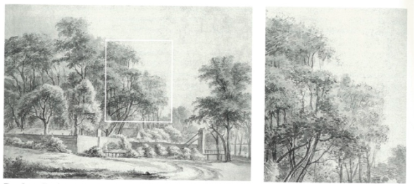
Jan van Kessel, Cat. no. 17 with framed detail, enlarged at right. Zigzag tree-fill strokes in black chalk are easily observed at the right of periphery of foliage.
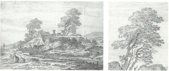
Pieter Molyn, Cat. no. 20, with framed detail, enlarged at right. The artist delineates almost all of the peripheral and frontal foliage with tree-fill strokes of connected, inverted U’s in black chalk.
Objective Analysis of Graphic Stroke Formation
The art of drawing has recently attracted close scrutiny from neuroscientists and psychologists. These researchers have shown convincingly that handwriting and drawing strokes and the “style” with which they are applied are under certain invariant biologic controls. (A selection of scientific reports in this field is referenced.10 - 19) Part of the biologic control for these manual activities derives from limb-muscle limits peculiar to the individual’s hand, wrist, and arm, and part comes from programmed path ways innately “wired” into the central nervous system.
New research instrumentation has triggered a boom in the number of published studies examining factors involved in the production of human graphic tasks. Specialized computer software and digitized writing tablets are now available to record electronically every stroke, curve, and pattern in the dynamic processes of writing and drawing. At present, this apparatus can recognize and process strokes less than 0.02 millimeters in width, 25-times narrower than a fine-point pencil lead.
Cursive handwriting is particularly targeted in investigations, since there is great commercial promise for a technology that may be able to claim a breakthrough such as signature recognition.20 Writing familiar words like one’s name is almost identical to practiced, repetitive drawing movements. Therefore, the results of these hand writing experiments are also applicable in the development of a scientific basis to help identify the subtly encoded graphic “signatures” of artists.
We are living in a digital age that encourages the eye to welcome novel ways of seeing images. In this context, we should suspend, for the moment, the usual focus on aesthetics and style to concentrate on a drawing’s less obvious character. Drawing experiments indicate that the hand of an individual follows characteristically repeatable path ways in creating cursively drawn lines. For example, a surprisingly limited number of graphic shortcuts exist for a landscape artist to fulfill the task of rapidly drawing in the foliage for trees and forests with pen or pencil. Leaves on trees - or tree-fill, as I call it - are most frequently represented in old master drawings by zigzag patterns resembling connected U’s or V’s Fig. 1 Fig. 2.
The often inconspicuous, rapid zigzags of tree-fill can offer telltale clues about the specific anatomy and motions of the artist’s drawing hand. In other words, these strokes may carry the unique imprint of the draftsman’s arm wrist-hand characteristics, elements of his identity. In kinesiology (the study of body movements), the “principle of least effort” establishes the way we physically carry out tasks, including manual work. Thus, from their student days onward, most artists execute their drawing strokes, especially the rapidly repeated forms and hatching, in the most efficient manner for maximum conservation of muscular, articular, and cerebral energies. By studying the slants of the angular loops or vertices of the connected “U” strokes and “V” strokes, a useful diagnostic factor becomes available to help determine if a drawing is right. The most readable tree-fill strokes are found usually around the borders of foliate trees with the closed side of the US and V’s facing out. I describe the direction of these graphic forms using clock-face nomenclature. For example, tree-fill positioned at 8 o’clock indicates strokes inclined downward around 30 degrees from the horizontal with the U-shaped and V-shaped elements facing outward towards the lower left border of the tree. Usually, an artist’s tree-fill is set down in two principal, and opposite, directions along closely related, if not identical, axes; this bidirectionality is made possible by elasticity in finger maneuvers in the presence of relatively inelastic arm-hand movements. Some circumstances are responsible for exceptions and atypical variations: right left handedness differences; variables involving the artist’s angular placement of the paper; whether the artist was seated or standing; and differences that may be associated with age-related physical or mental infirmities.
Nonetheless, experimental studies and my own observations indicate that the favored form, slant and direction of such tree-fill strokes are largely invariant for the individual.
Examples of this biologically based graphic constancy are seen in the landscape drawings of Roelant Roghman, a talented member of Rembrandt’s Amsterdam circle. Roghman demonstrates several graphic styles in his 149 known, signed drawings (see Sumowski21 and van der Wyck22). Close analysis of his tree-fill, the shorthand artistic representations for leaves, boughs, and leaf clusters, provides remarkable evidence of a qualitative unity throughout his stylistically assorted range of drawings. In this exhibition, the two signed landscape drawings by Roghman show obvious stylistic differences. Yet, the form and orientation of his tree-fill strokes are identical in both ( Fig. 3 Fig. 4). His “Broad river view with wooded shores” (Cat. no. 23) shows a delicate style with tree-fill executed by thinly penned outlines under brushwork. Contrast this with his majestic “High trees by a river with a town in the distance” (Cat no. 24), exhibiting sweeping pen strokes and wash as tree-fill. In both drawings, the orientation of the tree-fill pen strokes is the same: Roghman characteristically drew his tree-fill favoring 8 to 9 o’clock and 2 to 3 o’clock. Roghman’s drawings oeuvre as catalogued and illustrated by Sumowski” and van der Wyck” generally conforms to this pattern. Two notable exceptions (Sumowski nos. 2282 and 2283XX) are weighted with vertical (12 and 6 o’clock) tree-fill, rather than his customary horizontal strokes. This anomaly, coupled with other problems, leads me to conclude that these two unsigned drawings are not by Roghman.
Applying this criterion to left-handed artist Jan van Goyen, we find that the slope of his tree-fill belies his hand preference. It is not unusual for a left-hander to learn early how to camouflage his sinistrality by jockeying his hand and arm positions. Van Goyen’s tree-fill (see Cat. nos. 11-13) is angled like that of a typical right-hander, with a slight change seen in his last decade: before 1650s, 7 to 8 o’clock, 1 to 2 o’clock; 1650s, 8 to 9 o’clock, 1 to 2 o’clock. Pieter Molyn, a right-handed artist whose unsigned drawings have sometimes been confused with van Goyen’s work, seems to have a somewhat distinctive tree-fill “signature.” He articulates tree-fill with vertical strokes, mostly facing 10 to 2 o’clock, documented in this exhibition with two signed and dated drawings (Cat. nos. 19 and 20, and see Fig. 2), made at ages 39 and 64, two years before his death.
The truly profound artists seem to be more versatile in overriding the graphic shortcuts of tree-fill, and in developing original and utterly amazing ways to depict foliage. Jacob van Ruisdael is one such giant. Stylistically, both i Ruisdael drawings in this exhibition (Cat. nos. 26 and 27) appear to be from the early 1650s, one of his most productive periods as a young artist. His primary tree-fill device at this time was multidirectional zigzags composed of three to six connected “V” or “U” units. Seymour Slive was among the first specialists to recognize that Ruisdael favored oak trees in his landscapes. Both of the Ruisdael drawings here prominently feature oaks. Quite remarkably, Ruisdael deliberately distorts his rapid tree-fill hatching along some of the bough tops to replicate the stellate lobes of oak leaves. This brilliant, naturalistic device is particularly clear high on the wonderfully articulated oak in the left foreground of Cat. no. 27 (Fig. 5).
With these examples, I have attempted to demonstrate some of the strikingly individual constancy in execution and articulation of basic drawing tasks, even by artists of the highest skill and originality. Invariant graphic stroke traits, such as those evident in tree-fill, may indeed give connoisseurs another modus operandi. Bold, innovative artists, like Jacob van Ruisdael, may often consciously overpower some of the biologically determined stroke patterns and will surely stand out; controversial works at the border of their oeuvres may now be reassessed in light of this new criterion.
For the eager specialist, a sampling of other natural, drawing-related articulatory constraints and biases are:
- In the formation of connected vertical strokes, the down-strokes are always stronger than the up-strokes and a down-stroke is usually the initial vertical stroke in a series.
- In the formation of connected horizontal strokes, stroke order is from top to bottom of the series.
- Right-handers start horizontal strokes from the left, and left-handers start them from the right.
- Copying is characterized by strokes of shorter length than in the original, more pauses (“pen-up” moments), and angles drawn more acutely than in the original.
What works for drawings may not be so useful for paintings. Max Friedländer aptly contrasted the nature of drawings to paintings as the difference between wit and humor. The spontaneity of sketching is a prerequisite for the success of an analytical method based on the artist’s innate psychomotor limits. Detecting and sorting the involuntary elements from the willful elements in the less spontaneous, more elastic painting process, therefore, may well be beyond this type of method. Unlike the solid stroke delivery of the draftsman’s stylus, the tip of the painter’s brush is highly elastic and thus less reliable for stroke analysis.
These and other aspects of neuropsychology and human limb kinematics should have transferable value for connoisseurs, scholars, and students of drawings. I hope this introduction may serve to open artistically inclined eyes to new analytical directions, and to fuel efforts at this interface from others. Stroke analysis is simply another tool to add to the serious student’s armamentarium for an understanding of authenticity. Goethe, who drew copiously and collected drawings, noted that we hear and see only what we understand. The study of old master drawings with their stimulating challenges in connoisseurship surely must have extended his grand sensory range. I believe the field remains just as exciting and promising for us today.
- SHELDON PECK
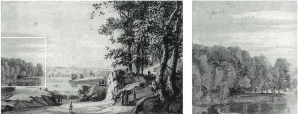
Roelant Roghman, Cat. no. 23, with framed detail, enlarged at right. Tree-fill strokes are visible as thinly penned outlines under washes.
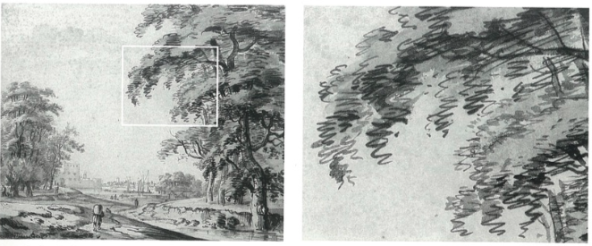
Roelant Roghman, Cat. no. 24, with framed detail, enlarged at right. Comparisons with the detail from the previous drawing by Roghman (Fig. 3) reveal congruence in the form and direction of the artist’s penned tree-fill strokes, despite obvious stylistic differences.
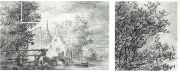
Jacob van Ruisdael, Cat. no. 27, with framed detail, enlarged at right, showing Ruisdael’s exceptional control of tree-fill hatching to represent the stellate lobes of oak leaves at the tree’s upper periphery.
References
Asher, Richard. Six honest serving men for medical writers. Journal of the American Medical Association 1969, vol. 208, pp. 83-87.
Frey, Karl. Der literarische Nachlass Giorgio Vasaris, vol. 2, Munich, 1930, PP. 901-902.
Hirst, Michael. Michelangelo and his Drawings. New Haven, Yale University Press, 1988, pp. 16-21.
Perrig, Alexander. Michelangelo’s Drawings. The Science of Attribution. (M.Joyce, transl.) New Haven, Yale University Press, 1991, pp. 1-34
Van de Wetering, Ernst. Rembrandt, The Painter at Work. Amsterdam, Amsterdam University Press, 1997, pp. 47-73.
Brown, Jonathan. King and Connoisseurs. Collecting Art in Seventeenth-Centuty Europe. Princeton, Princeton University Press, 1995.
Morelli, Giovanni. Italian Painters. Critical Studies of Their Works. (C.J. Ffoulkes, transl.), 2 vols., London, John Murray, 1893-1900
Tietze, Hans. Genuine and False. Copies, Imitations, Forgeries. New York, Chanticleer Press, 1948, pp, 46-47.
Schatborn, Peter. Aspects of Rembrandt’s draughtsmanship. In: Holm Bevers, Peter Schatborn, Barbara Wetzel. Rembrandt: The Master & his Workshop, Drawings & Etchings. New Haven, Yale University Press,1991, pp. 15-34.
Van Sommers, Peter. Drawing and Cognition: Descriptive and Experimental Studies of Graphic Production Processes. New York, Cambridge University Press, 1984.
Van Sommers, Peter. A system for drawing and drawing-related neuropsychology. Cognitive Neuropsychology 1989, vol. 6, pp. 117-164.
Thomassen, Arnold J. W. M.; Teulings, Hans-Leo, Constancy in stationary and progressive handwriting. Acta Psychologica 1983, vol. 54, pp. 179-196.
Teulings, Hans-Leo; Schomaker, Lambert R. B. Invariant properties between stroke features in handwriting. Acta Psychologica 1993, vol. 82, pp. 69-88.
Meulenbrock, Ruud G. J.; Thomassen, Arnold J. W M. Exploitation of elasticity as a biochemical property in the production of graphic stroke sequences. Acta Psycholigica 1993, vol. 82, pp. 313-327.
Lacquaniti, F.; Ferrigno, G.; Pedotti, A.; Soechting, J. F.; Terzuolo, C. Changes in spatial scale in drawing and handwriting; Kinematic contributions by proximal and distal joints. Journal of Neuroscience 1987, vol. 7, pp. 819-828.
Maarse, Frans J.; Thomassen, Arnold J. W. M. Produced and perceived writing slant: Difference between up strokes and down strokes. Acta Psycholigica 1983, vol. 54, pp. 131-147.
Wing, Alan M.; Nimmo-Smith, M. Ian; Eldridge, Margery A. The consistency of cursive letter formation as a function of position in the word. Acta Psychologica 1983, vol. 54, pp. 197-204.
Meulenbroek, Ruud G. J.; Rosenbaum, David A.; Thomassen, Arnold J. W M.; Schomaker, Lambert R. B. Limb-segment selection in drawing behaviour. Quarterly Journal of Experimental Psychology 1993, vol. 46(A), pp. 273-299.
Desbiez, Dominique; Vinter, Annie; Meulenbroek, Ruud G, J. Biomechanical and perceptual determinants of drawing angles. Acta Psychologica 1996, vol. 94, pp. 253-271.
Plamondan, Rejean; Suen, Ching Y.; Simner, Marvin L., editors. Computer Recognition and Human Production of Handwriting. Singapore, World Scientific, 1989.
Sumowski, Werner. Drawings of the Rembrandt School. vol. 10, New York, Abaris., 1992, pp. 4992-5173.
Van der Wyck, H. W. M. Dr kasteeltekeningen van Roelant Roghman.vol. 1, Alphen aan den Rijn, Canaletto, 1989, pp, 21-242.

